SingleCare: Drug Page UX
A/B TEST • 2026
At a Glance
I led an A/B test on SingleCare’s drug page for mobile web where users confirm their prescription, compare pharmacy prices, and decide whether to get their savings card. Every metric improved, with pharmacy claims up 10% and downstream conversions up 7–9%. The key insight wasn’t about adding features. It was about removing confusion.
Context
SingleCare is a free prescription savings platform. Users search for a medication, compare prices at nearby pharmacies, and get a discount card to use at the counter. The drug page is where users select the right prescription details and select their pharmacy and price.
As the product designer on SingleCare, one of my core responsibilities is running the experimentation program for the site. That means sourcing potential improvements from stakeholders and from my own analysis of user data, prioritizing that list, and working through it. For simpler visual or layout tests, I build the variants myself. For more complex tests that involve data or logic, I write tickets and coordinate with engineering. This project came out of that process.

Research
We had a recent round of customer interviews where we watched users navigate the site in real time. They were always able to figure out what they needed to do, but it was never instant. They would click around a little and explore before honing into the task at hand.
Two of the key issues were:
- The prescription details field. Users would select this field to read the details to learn that this is where they could make changes, then check their prescription to make sure it matched.
- The location field. Users could see it, but didn’t understand what it was driving. There was no clear connection between their location and the prices on screen.
The page had too many things competing for attention. What users needed was better context and more intentional placement. A page that explained itself instead of asking users to decode it.
Constraints
This page doesn’t belong entirely to the user experience. SEO content, account prompts, and legal disclosures all have real estate here, and none of them were going anywhere. I knew that going in, so the goal was never a dramatic redesign. It was about making precise, measurable improvements within the space I had.
There was also a testing philosophy to honor: incremental changes, independently measurable. No sweeping redesigns where you can’t tell what caused the changes in behavior. These constraints forced a useful level of precision.
Design Approach
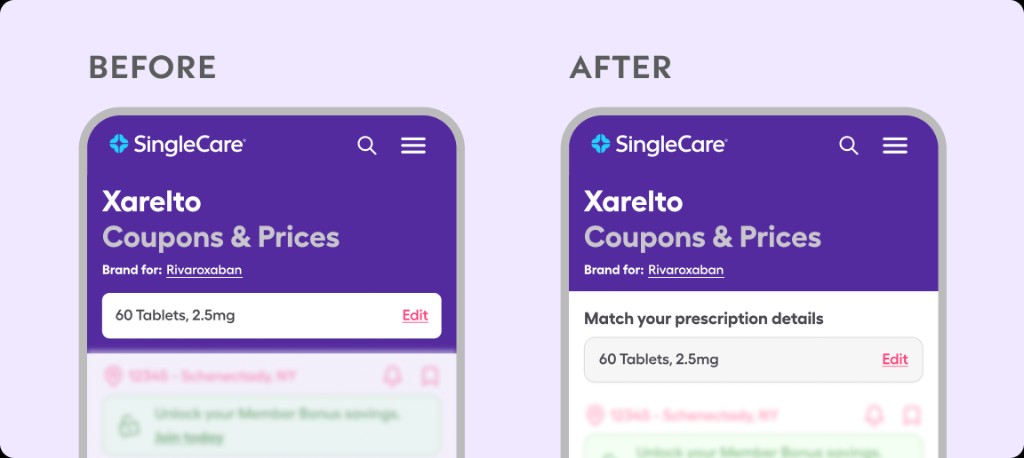
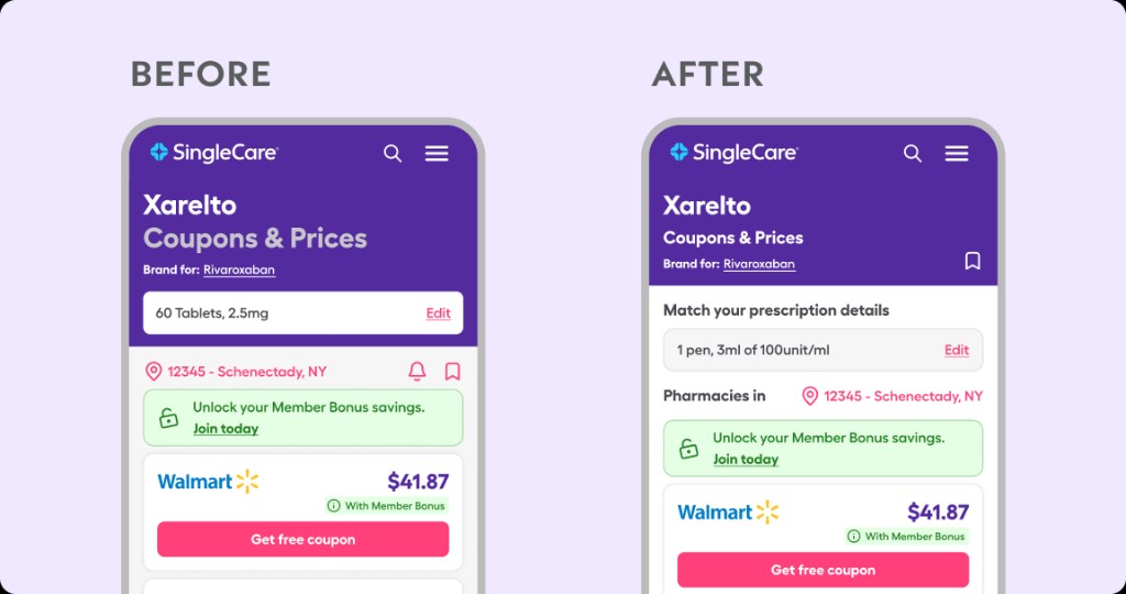
Prescription details got their own section
The original design buried prescription info in the general page flow. I pulled it into its own clearly labeled section that signaled ownership: this is your information, check that it’s right.
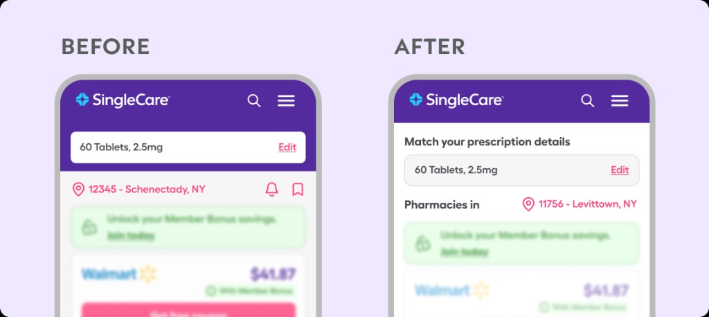
Location got connected to results
I replaced the bare location field with “Pharmacies in [location].” Before, the location was a data point sitting on the page. After, it explained itself: this is why you’re seeing these prices at these pharmacies.
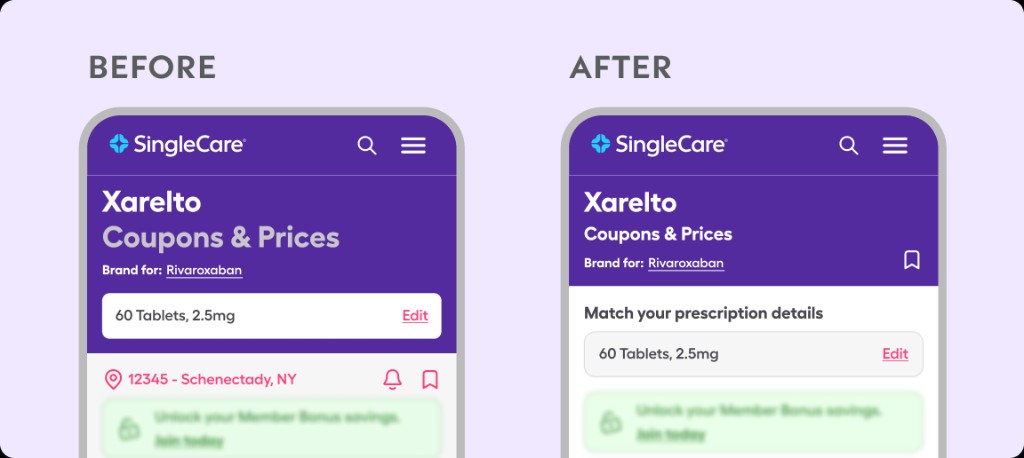
Drug save moved to the header
The save feature was jumbled in line with the location and price alert. It presented as a concise action row, but with little affordance for what each of those icons did. Moving it to the top section of the page gave it higher prominence and tied its action to the drug as a whole, making it clear what the bookmark icon next to the drug name would do.
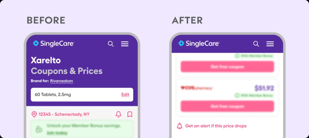
Price alert moved to the bottom of the price list
This function had very little usage to begin with, but the impact it has on getting users to return to SingleCare is very high. Its current placement in the action row left it unclear to users what it would do. The thought behind its new placement was to present it to users who did not like the prices they were seeing for the drug at that time. So when they scroll to the bottom they are given hope to be alerted to a potential lower price.
Final results
What Happened
The test ran as a 50/50 split for mobile web users for around two weeks. I monitored the key metrics for statistical significance before stopping the test and creating the final report.
Every metric improved.
- +8% Location Edits
- +10% Savings Card Use
- +40% Drug Saves
- +120% Price Alerts
The most interesting result was the prescription field. Clicks went down, but coupon clicks stayed consistent and usage at the pharmacy went up 10%. Users no longer needed to click into the prescription field to understand it. The clearer design gave them enough context to confirm their details and keep moving.
What I’d Do Differently
I’d push for qualitative data during the test, not just before it. The quantitative results were strong, but running a few moderated sessions with the new variant would have helped validate the experience further and could lead to more helpful insights.
Impact
The variant became the new default mobile experience and the improved metrics have held. I then applied the same clarity-first approach to the desktop drug page, and the results have been impactful there as well.
This project was a reminder to focus on what really matters in the design. What does the user need to interact with or verify, and what’s getting in the way of that?